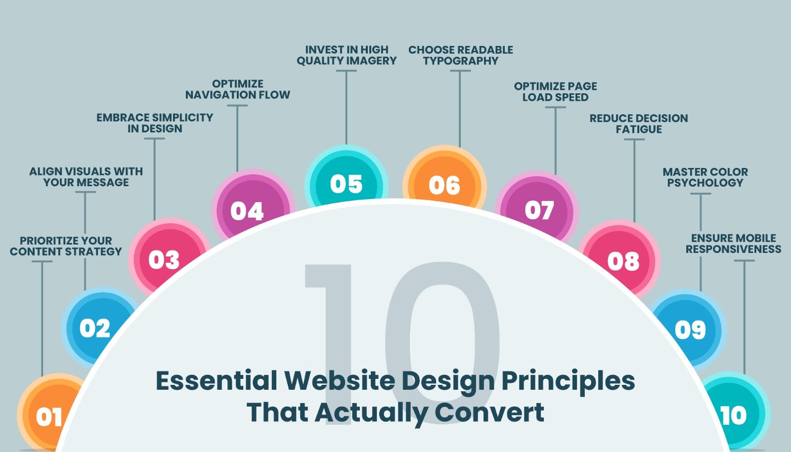
10 Essential Website Design Principles That Actually Convert

November 4, 2025

10 Essential Website Design Principles That Actually Convert

Your website just cost you Rs 50,000 in lost sales this month.

Sounds dramatic? Let me paint you a picture.

  • A potential customer clicks on your ad. They’re interested. They’re ready to buy. They land on your website. The page takes 8 seconds to load. Once it finally appears, they’re greeted with tiny, unreadable fonts, a confusing menu, and images that look like they were taken on a 2010 flip phone.
  • What do they do? They hit the back button in 3 seconds flat and buy from your competitor instead.
  • Here’s the brutal truth: You have less than 3 seconds to make a first impression. In those precious moments, visitors aren’t reading your carefully crafted copy. They’re not analyzing your value proposition. They’re judging hard.

  • And 94% of that judgment? Pure design.
  • Think about your own behavior. When was the last time you trusted a website that looked like it was built in 2005? When did you last complete a purchase on a site that felt clunky and confusing? Exactly. Never.

Your website isn’t just a digital brochure anymore. It’s your:

  • 24/7 salesperson
  • First impression generator
  • Trust builder (or destroyer)
  • Revenue engine (or money pit)

Here’s what keeps most business owners up at night: They’ve invested thousands in a website, but it’s converting visitors at barely 1%. Meanwhile, their competitor with a cleaner, faster, more intuitive site? They’re laughing all the way to the bank with 5-7% conversion rates.

The difference isn’t budget. It’s not about having the fanciest animations or the most expensive developer.

It’s about understanding the psychology of what makes people stay, engage, and buy.

So here’s my promise: By the end of this blog, you’ll know exactly what’s making visitors bounce from your site and how to fix it. These aren’t theoretical concepts. These are battle-tested principles that separate million-rupee websites from those collecting digital dust.

Ready to stop hemorrhaging money and start converting? Let’s dive in.

TABLE OF CONTENTS

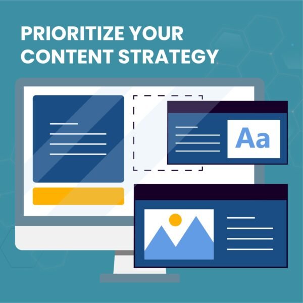
PRIORITIZE YOUR CONTENT STRATEGY
  • Your content is the backbone of your website. It’s what attracts visitors and keeps them engaged or sends them running to your competitors.
  • Well-crafted copy with strategic CTAs and compelling power words creates loyal, returning visitors. On the flip side, poorly written content with weak messaging can destroy your conversion potential instantly.
  • Research shows that 38% of visitors will abandon a website if the content feels unappealing or irrelevant. Even more alarming? 89% of users will visit a competitor’s site if they can’t find what they’re looking for on yours.

Key considerations:

  • Avoid excessive jargon that alienates your audience

  • Keep your language clear and accessible

  • Update content regularly to maintain relevance

  • Use power words that trigger emotional responses

  • Structure content for easy scanning (headlines, bullet points, short paragraphs)

Remember: Your content should speak directly to your audience’s pain points and offer clear solutions.

ALIGN VISUALS WITH YOUR MESSAGE
  • There’s nothing more confusing for a visitor than landing on a page where the visuals tell one story and the text tells another.
  • Visual consistency isn’t just about aesthetics it’s about clarity. When your images, graphics, icons, and illustrations complement your written content, you create a cohesive narrative that guides visitors smoothly through their journey.
  • Most visitors are visual learners. They process images 60,000 times faster than text. That means your visuals aren’t just decorative they’re essential communication tools.

Best practices:

  • Ensure every image supports your message
  • Use graphics to break down complex concepts
  • Maintain consistent visual style across all pages
  • Choose imagery that resonates with your target audience

The old saying holds true: a picture speaks a thousand words. But only when it’s the right picture saying the right things.

EMBRACE SIMPLICITY IN DESIGN
  • Is your website overwhelming? Too much text? Cluttered with competing visual elements? If you answered yes to any of these, it’s time to simplify.
  • Minimalist design isn’t about being boring—it’s about being intentional. When you strip away the unnecessary, what remains becomes more powerful.

Guidelines for simplicity:

  • Stick to a maximum of 5 colors in your palette
  • Use no more than 3 font families
  • Give your content room to breathe with adequate white space
  • Focus on one primary action per page
  • Simple doesn’t mean plain. It means purposeful. Every element on your page should earn its place by serving a specific function.
  • When done right, simple design lets your most important content shine, makes your site feel more spacious and modern, and dramatically improves user experience.
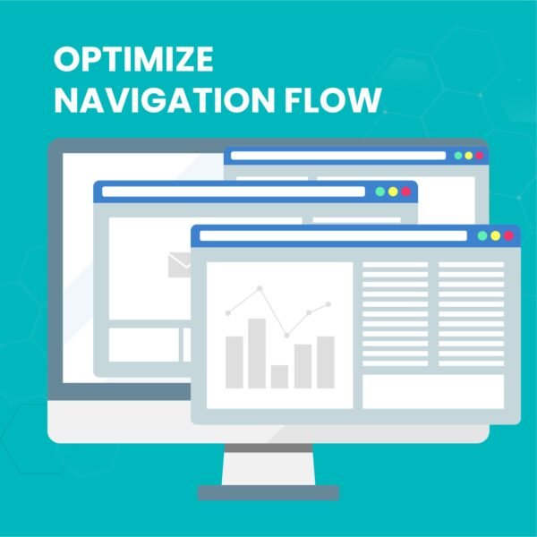
OPTIMIZE NAVIGATION FLOW
  • Navigation might seem like a minor detail, but it’s actually one of the most critical factors in user retention.
  • Think about it if visitors can’t find what they’re looking for within seconds, they’ll leave. It’s that simple.
  • For websites with extensive content, navigation becomes even more crucial. You need to create a logical, intuitive path that guides users effortlessly to their destination.
  • Pro tip: Apply the “Rule of Thirds” principle from photography to your layout. Divide your page into nine equal sections (three rows, three columns). The center section is where user attention naturally gravitates place your most important elements there.

Navigation essentials:

  • Keep your menu structure flat and simple
  • Use clear, descriptive labels
  • Implement breadcrumbs for complex sites
  • Include a search function for content-heavy sites
  • Make sure clickable elements look clickable

Good navigation is invisible. Users shouldn’t have to think about it—it should just work.

INVEST IN HIGH-QUALITY IMAGERY
  • Nothing screams “amateur” quite like low-resolution, pixelated images.
  • High-quality visuals are non-negotiable in modern web design. They convey professionalism, attention to detail, and brand credibility. The numbers back this up: websites with high-quality images retain up to 94% more viewers.

Image strategy:

  • Use high-resolution images that stay sharp across all devices
  • Avoid overused stock photos that feel generic
  • Consider custom photography or illustrations for brand differentiation
  • Use vector graphics or PNG formats when appropriate (they scale without quality loss)

Yes, high-resolution images can increase load times but that’s where optimization comes in. Compress your images without sacrificing quality, and consider using modern formats like WebP for better performance.

Your images should create a “wow” factor that makes visitors want to explore further.

CHOOSE READABLE TYPOGRAPHY
  • No matter how stunning your design is, text remains the primary way you communicate with visitors.
  • Typography isn’t just about picking a font you like it’s about ensuring your message is easily readable across devices, screen sizes, and viewing conditions.

Typography guidelines:

  • Limit yourself to 3 font families maximum
  • Skip the overly decorative fonts for body text
  • Use web-safe fonts like Arial, Calibri, or Sans Serif for maximum compatibility
  • Maintain proper contrast between text and background
  • Set appropriate font sizes (minimum 16px for body text)

Yes, high-resolution images can increase load times but that’s where optimization comes in. Compress your images without sacrificing quality, and consider using modern formats like WebP for better performance.

Your images should create a “wow” factor that makes visitors want to explore further.

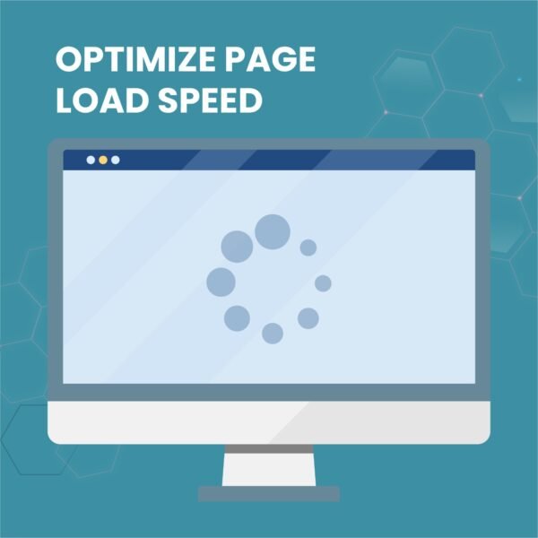
OPTIMIZE PAGE LOAD SPEED
  • You’ve built an amazing website with stunning visuals and incredible features. But here’s the harsh reality: if it takes too long to load, none of that matters.
  • Page speed is a conversion killer. Studies show that 53% of mobile users abandon sites that take longer than 3 seconds to load. Every extra second of load time can result in a 7% reduction in conversions.

Common causes of slow load times:

  • Oversized, unoptimized images
  • Poorly written or bloated code
  • Too many HTTP requests
  • Slow server response times
  • Lack of browser caching

Speed optimization tactics:

  • Compress all images before uploading
  • Minimize CSS and JavaScript files
  • Upgrade to a better hosting plan if needed
  • Implement lazy loading for images
  • Use a Content Delivery Network (CDN)
  • Enable browser caching

Fast websites don’t just convert better they also rank higher in search engines. Speed optimization is a win-win.
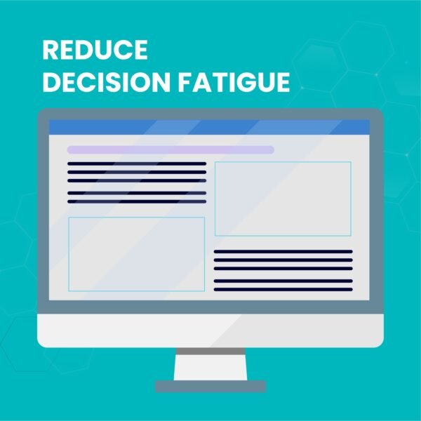
REDUCE DECISION FATIGUE
  • Before designing your website, get crystal clear on its purpose. An eCommerce site needs different elements than a portfolio site. A B2B service website has different goals than a travel blog.
  • Here’s where psychology comes in. Ever heard of Hick’s Law? It states that the time it takes someone to make a decision increases with the number of choices they’re presented with.
  • In practical terms: the more options you give visitors, the harder it becomes for them to choose anything often resulting in no action at all.

Application of Hick’s Law:

  • Limit the number of menu items
  • Reduce form fields to essentials only
  • Offer one clear primary call-to-action per page
  • Avoid overwhelming product categories
  • Streamline your checkout process

Guide your visitors down a clear path. Make the next step obvious. Remove friction at every opportunity.

MASTER COLOR PSYCHOLOGY
  • Colors aren’t just decorative they’re powerful psychological triggers that influence emotions, behavior, and decision-making.
  • The right color scheme can evoke trust, excitement, calmness, or urgency. The wrong one can create confusion and mistrust.

Color strategy framework:

  • Limit your palette to 5 colors maximum

  • Use your brand colors as the foundation
  • Consider color psychology (blue = trust, red = urgency, green = growth)
  • Ensure adequate contrast for readability
  • Test color combinations across different devices

Pro tip: Use color picking tools like Adobe Color or browser plugins to extract a color scheme directly from your logo. This ensures perfect brand consistency.

Colors should work together harmoniously, guide attention to important elements, and reinforce your brand identity at every touchpoint.

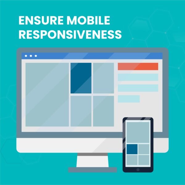
ENSURE MOBILE RESPONSIVENESS
  • Here’s a stat that should wake you up: over 50% of all website traffic now comes from mobile devices. In countries like India, Nigeria, and Ghana, that number is even higher.
  • If your website doesn’t work seamlessly on mobile, you’re literally turning away more than half your potential audience.
  • Mobile optimization isn’t just about shrinking your desktop site it’s about reimagining the user experience for smaller screens and touch interactions.

Mobile essentials:

  • Implement responsive design that adapts to any screen size
  • Ensure buttons and links are easy to tap (minimum 44×44 pixels)
  • Optimize images for mobile loading speeds
  • Simplify navigation for smaller screens
  • Test on actual devices, not just emulators
  • Consider mobile-first design approach

Desktop might be where you design, but mobile is where your users live. Design accordingly.

FREQUENTLY ASKED QUESTIONS

1.How long does it take to improve website conversion rates?2025-11-14T11:59:17+05:30
  • Quick wins like page speed optimization and mobile responsiveness show results within 7-14 days. For significant conversion improvements (2-5%), expect 4-8 weeks of consistent optimization. Pro tip: Start with high-impact changes first speed and mobile optimization can double your conversions immediately.
2.Do I need a complete website redesign or just updates?2025-11-14T11:59:39+05:30
  • Start small, win big. Focus on these high-ROI website improvements first: page load speed, mobile design, and navigation. You don’t need a costly redesign strategic updates to these core elements can boost conversions by 200-300% without touching your entire site.
3.What’s a good website conversion rate in 2025?2025-11-14T12:00:03+05:30
  • Industry benchmarks: E-commerce (2-3%), B2B services (5-10%), SaaS (3-5%). Below 2%? Your website design is costing you serious money. Implementing these conversion optimization principles can realistically triple your current rate in 90 days.
4.Can I optimize my website myself or hire a professional?2025-11-14T12:00:24+05:30
  • DIY these: content strategy, color psychology, image selection, and CTAs. Hire pros for: page speed optimization, custom responsive design, and complex navigation systems. Smart move? Handle strategy yourself, invest in technical expertise for implementation best ROI combination.
5.Which website design mistakes cost the most sales?2025-11-14T12:00:49+05:30
  • The big three conversion killers: Slow load speed (53% bounce rate), poor mobile experience (loses 50%+ traffic), and confusing navigation (drives 89% to competitors). Fix these first using heat maps and Google Analytics you’ll see immediate revenue impact.
6.How do I know which design issues are hurting my conversions?2025-11-14T12:01:16+05:30
  • Use Google Analytics, Hotjar, or Microsoft Clarity to track user behavior. Red flags: Bounce rates above 60%, average session time under 30 seconds, mobile bounce rates higher than desktop. Heat maps reveal exactly where users click, scroll, and abandon your roadmap to fixing conversion leaks.
7.Should I prioritize desktop or mobile website design first?2025-11-14T12:01:42+05:30
  • Mobile-first, always. Over 60% of web traffic comes from mobile devices in 2025. If your site isn’t mobile-optimized, you’re losing more than half your potential customers before they even see your offer. Optimize mobile experience first, then enhance desktop not the other way around.
8.How often should I update my website design?2025-11-14T12:02:07+05:30
  • Design tweaks: Quarterly. Major refresh: Every 24-36 months. But here’s the real answer: Update immediately when analytics show declining conversions or rising bounce rates. Don’t wait for scheduled updates respond to data, not calendars.
THE BOTTOM LINE

The question isn’t whether your website needs optimization it’s how much money you’re losing every single day you delay.

While you’re reading this, potential customers are landing on your site, judging it in 3 seconds, and clicking back to your competitors. Every day, your slow, cluttered, mobile-unfriendly website is turning away ready-to-buy customers.

Your competitors aren’t waiting. They’re optimizing. They’re converting. They’re capturing your customers.

The strategies are proven. The tools are ready. The ROI is undeniable.

What’s stopping you from capturing those lost sales?

READY TO STOP LOSING CUSTOMERS?

Get Your FREE Website Conversion Audit

Discover exactly where your website is hemorrhaging money and get a clear action plan to fix it. Zero fluff. Just data-driven insights and revenue projections based on your traffic.

Your Conversion Audit Includes:

  • Complete conversion funnel analysis – See where visitors drop off
  • Mobile & desktop performance report – Speed issues costing you sales
  • Competitor comparison dashboard – How you stack up in your industry
  • Revenue recovery calculator – Exact rupee value you’re losing monthly
  • 30-day action roadmap – Prioritized fixes with highest ROI first
  • Custom recommendations – Solutions tailored to your specific business

Only 3 audits available per month. Book yours before slots fill.

Go to Top